Depletion observation example
depletion-observation-example.RmdWe begin by importing the isw package along with other
data analysis and plotting packages
library(isw)
#> Loading required package: expint
#> Loading required package: units
#> udunits database from /Library/Frameworks/R.framework/Versions/4.4-arm64/Resources/library/units/share/udunits/udunits2.xml
library(patchwork)
library(units)
library(png)
library(dplyr)
#>
#> Attaching package: 'dplyr'
#> The following objects are masked from 'package:stats':
#>
#> filter, lag
#> The following objects are masked from 'package:base':
#>
#> intersect, setdiff, setequal, union
library(ggplot2)
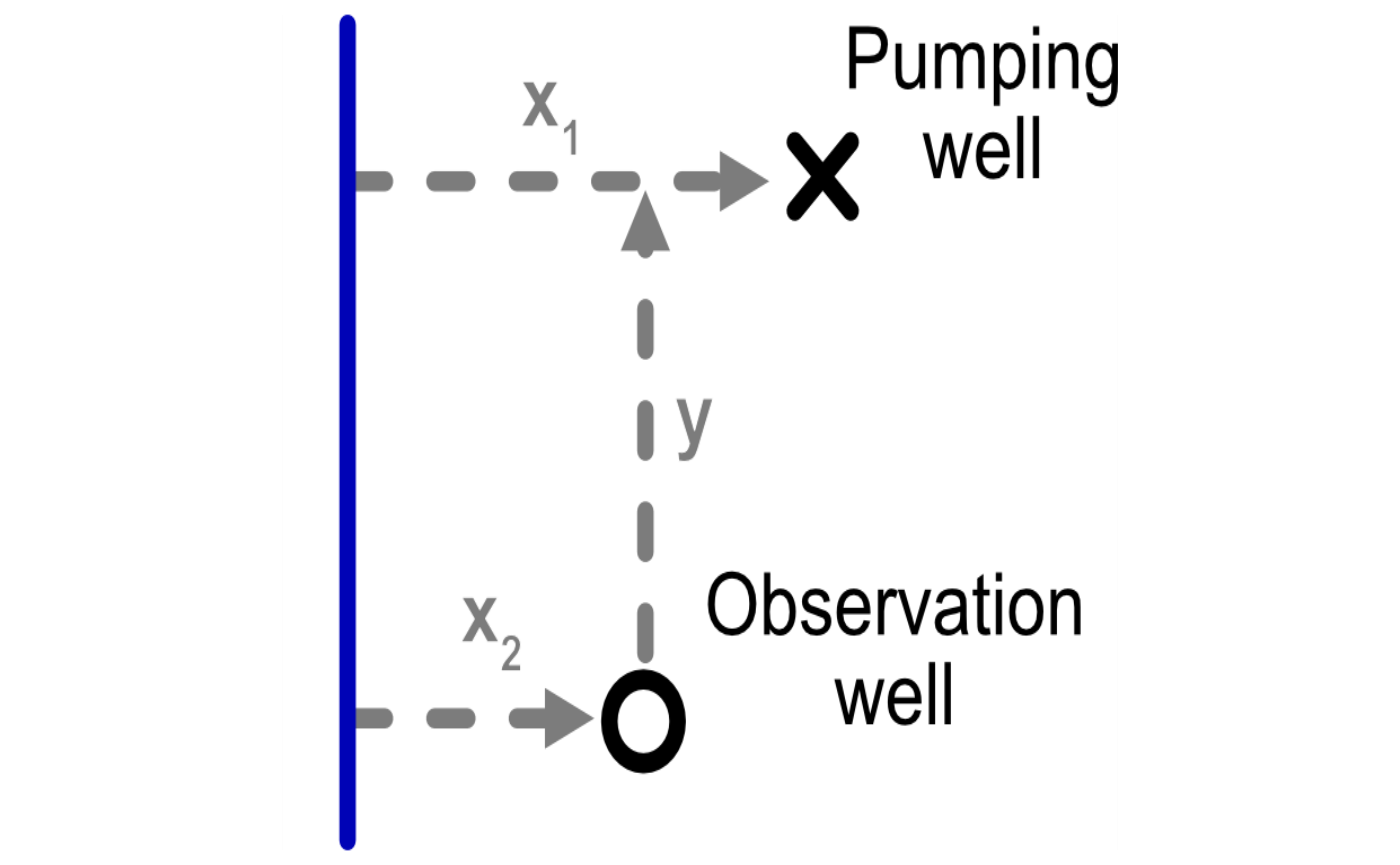
library(tidyr)Let’s look at how the package handles the configuration between river, pumping well, and observation well. As shown in the figure below, we need to keep track of the following variables:
-
x1: Distance from the pumping well to the river -
x2: Distance from the observation well to the river -
y: Component of the distance between the two wells that is parallel to the river
We also need to consider aquifer parameters. We parameterize an aquifer with the following characteristics, based on the Glover paper:
- Saturated thickness (
D): 100 ft - Permeability (
K): 0.001 ft/sec - Drainable porosity of the aquifer (
V): 0.2
# example from Glover
# x1 <- set_units(c(1, 5, 10, 25, 50) * 1e3, 'ft')
D <- set_units(200, 'ft')
K <- set_units(0.001, 'ft/sec')
# t_sec <- set_units(1, "year") # sec in a year
V <- 0.2
Prepare themes for plotting
To make the plots look nice, we can create the following themes.
txt_size <- 12
theme_basic <- theme(
  line = element_line(size = 1, color = "black"),
  panel.background = element_rect(fill = "white"),
  legend.text = element_text(size = txt_size*0.9, color = "black"),
  axis.title.x = element_text(size = txt_size, colour = "black"),
  axis.title.y = element_text(size = txt_size, angle = 90, colour = "black"),
  legend.title = element_text(size = txt_size, color = "black"))
#> Warning: The `size` argument of `element_line()` is deprecated as of ggplot2 3.4.0.
#> ℹ Please use the `linewidth` argument instead.
#> This warning is displayed once every 8 hours.
#> Call `lifecycle::last_lifecycle_warnings()` to see where this warning was
#> generated.


theme_std <- theme_basic %+replace% theme(
  panel.border = element_rect(fill = NA, colour = "black", size = 1),
  panel.grid.major = element_blank(),
  panel.grid.minor = element_blank(), axis.line = element_blank(),
  axis.ticks.x = element_line(colour = "black", size = 0.5),
  axis.ticks.y = element_line(colour = "black", size = 0.5),
  axis.ticks.length = unit(1, "mm"),
  axis.text.x = element_text(size = txt_size*0.9, colour = "black"),
  axis.text.y = element_text(size = txt_size*0.9,  colour = "black", hjust = 1))
#> Warning: The `size` argument of `element_rect()` is deprecated as of ggplot2 3.4.0.
#> ℹ Please use the `linewidth` argument instead.
#> This warning is displayed once every 8 hours.
#> Call `lifecycle::last_lifecycle_warnings()` to see where this warning was
#> generated.

theme_diagram <- theme_basic %+replace%
  theme(
  panel.border = element_rect(fill = NA, colour = NA, size = 1),
  panel.grid.major = element_blank(),
  panel.grid.minor = element_blank(),
  axis.line = element_blank(),
  axis.ticks.x = element_blank() ,
  axis.ticks.y = element_blank(),
  axis.ticks.length = unit(1, "mm"),
  axis.text.x = element_blank(),
  axis.text.y = element_blank(),
  axis.title.x = element_blank(),
  axis.title.y = element_blank()) %+replace%
  theme(legend.position = c(0.8, 0.75), legend.box = 'vertical', legend.title = element_blank())
#> Warning: A numeric `legend.position` argument in `theme()` was deprecated in ggplot2
#> 3.5.0.
#> ℹ Please use the `legend.position.inside` argument of `theme()` instead.
#> This warning is displayed once every 8 hours.
#> Call `lifecycle::last_lifecycle_warnings()` to see where this warning was
#> generated.
Estimate drawdown under four configurations
We first generate a tibble of different permutations of
distances among the river, pumping well, and observation well.
pump_wells <- tibble(x1 = c(0.2, 0.8), `Pumping well` = c("c", "d"))
obs_wells <- tibble(y = c(0, 1.5), x2 = c(0.5), `Obs. well` = c("a", "b"))

locations <- crossing(pump_wells, obs_wells)%>%
  mutate(across(all_of(c("x1","x2","y")), function(x) set_units(x,"mi")), id = row_number())
To visualize these permutations we can plot them.
ggplot() +
  geom_point(data = pump_wells, aes(x1, y = 0, color = `Pumping well`), size = 4) +
  geom_point(data = obs_wells, aes(x2, y, shape = `Obs. well`), size = 4) +
  scale_shape_manual(values = c(0, 5)) +
  xlab("Distance from river (x)") + ylab("Distance between wells (y)") +
  scale_color_discrete("Well type") + theme_std + coord_equal()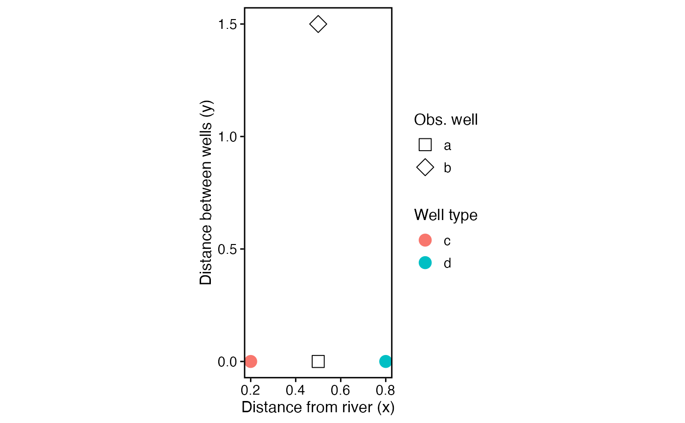
Add time variable (up to 5 years) and aquifer parameters to the tibble.
df <- locations %>%
  crossing(t = set_units(c(0.05, seq(0.1,5, by = 0.1)),'year')) %>%
  mutate(K = K, D = D, V = V)
Now we can get aquifer depletion with the
get_depletion_from_pumping function. As seen in the output,
the function returns a data.frame with two columns:
-
stream_depletion_fraction: The fraction of pumping at that timestep that is associated with stream depletion (opposed to drawing down the aquifer) -
aquifer_drawdown_ratio: The amount of aquifer drawdown (i.e., change in groundwater level) per unit pumping.
depletion <- get_depletion_from_pumping(df)
head(depletion)
#>   stream_depletion_fraction aquifer_drawdown_ratio
#> 1                 0.5522100    -0.2655826 [s/ft^2]
#> 2                 0.6742365    -0.4123014 [s/ft^2]
#> 3                 0.7662941    -0.5234929 [s/ft^2]
#> 4                 0.8082503    -0.5686320 [s/ft^2]
#> 5                 0.8335347    -0.5930033 [s/ft^2]
#> 6                 0.8508907    -0.6082457 [s/ft^2]
We can now add the depletion to the tibble to the original data frame for plotting and analysis.
df_calcs <- df %>%
  bind_cols(as_tibble(depletion))
head(df_calcs)
#> # A tibble: 6 × 12
#>     x1 `Pumping well`    y   x2 `Obs. well`    id      t      K    D     V
#>   [mi] <chr>          [mi] [mi] <chr>       <int> [year] [ft/s] [ft] <dbl>
#> 1  0.2 c                 0  0.5 a               1   0.05  0.001  200   0.2
#> 2  0.2 c                 0  0.5 a               1   0.1   0.001  200   0.2
#> 3  0.2 c                 0  0.5 a               1   0.2   0.001  200   0.2
#> 4  0.2 c                 0  0.5 a               1   0.3   0.001  200   0.2
#> 5  0.2 c                 0  0.5 a               1   0.4   0.001  200   0.2
#> 6  0.2 c                 0  0.5 a               1   0.5   0.001  200   0.2
#> # ℹ 2 more variables: stream_depletion_fraction <dbl>,
#> #   aquifer_drawdown_ratio [s/ft^2]
p_depletion_fraction <- ggplot(df_calcs,aes(as.numeric(t), as.numeric(stream_depletion_fraction), color = `Pumping well`)) +
  geom_line(aes(group = id)) +
  labs(x = "Time since pumping onset, years",
       y = "Fraction of well abstraction\nfrom stream depletion") +
  expand_limits(y= c(0,1)) +
  theme_std %+replace%
  theme(legend.position = "none")
p_drawdown_ratio <- ggplot(df_calcs,aes(as.numeric(t), as.numeric(-aquifer_drawdown_ratio), color = `Pumping well`)) +
  geom_line(aes(group = id)) +
  geom_point(data = df_calcs %>% dplyr::filter(abs(as.numeric(t)) %% 0.5 < 0.01),aes(shape = `Obs. well`), size = 3, stroke = 1) +
  scale_shape_manual(values = c(0, 5)) +
  expand_limits(y= c(0)) +
  labs(x = "Time since pumping onset, years",
       y = "Drawdown (ft) per\ncusec pumping") +
  theme_std %+replace% theme(legend.position = "none")

p_depletion_fraction / p_drawdown_ratio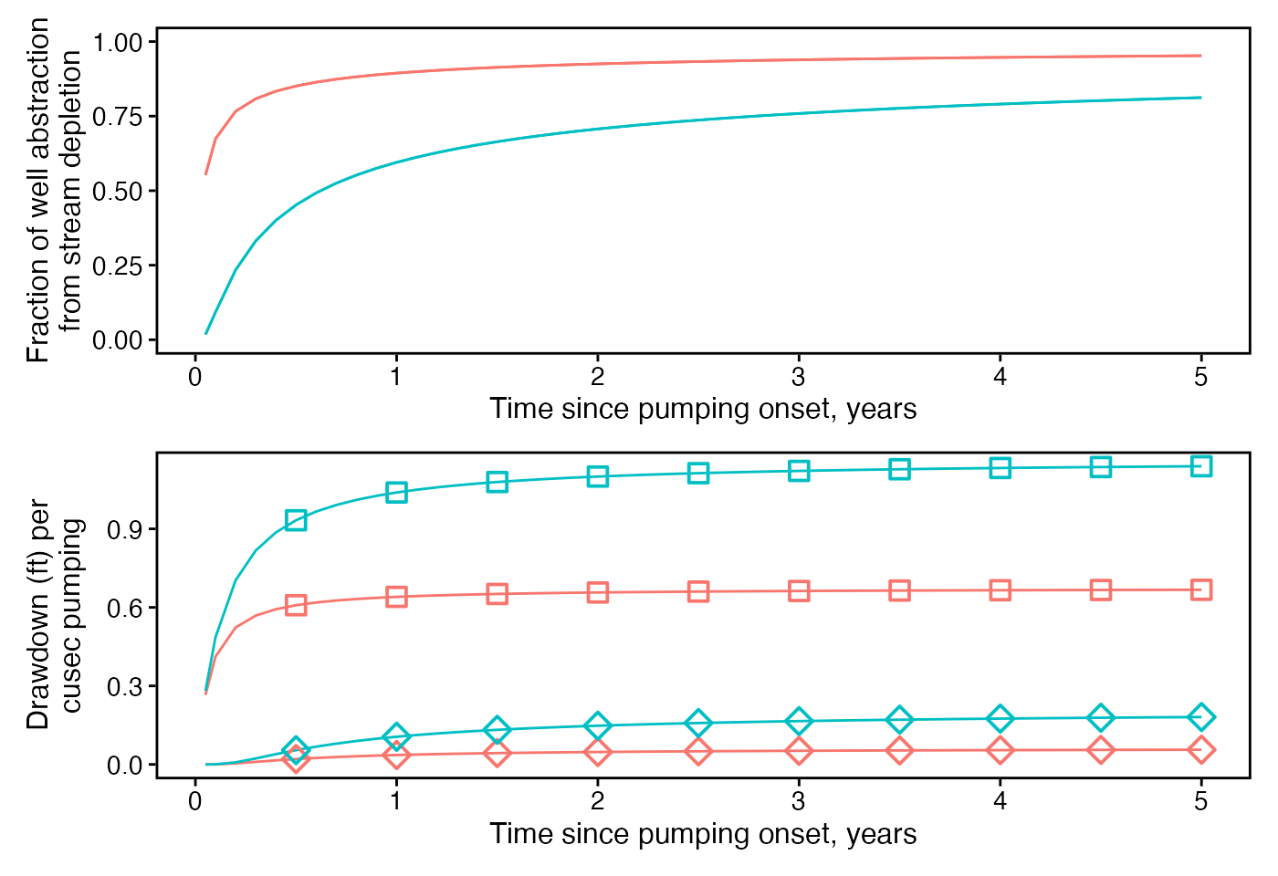
p_drawdown_depletion <- ggplot(df_calcs, aes(as.numeric(-aquifer_drawdown_ratio), as.numeric(stream_depletion_fraction), color = `Pumping well`)) +
  geom_point(data = df_calcs %>% dplyr::filter(abs(as.numeric(t)) %% 0.5 < 0.15),aes(shape = `Obs. well`), size = 3, stroke = 1) +
  scale_shape_manual(values = c(0, 5)) +
  # expand_limits(y= c(0)) +
  labs(x = "Drawdown (ft) per\ncusec pumping",
       y = "Fraction of well abstraction\nfrom stream depletion") +
  theme_std %+replace% theme(legend.position = "none")
p_drawdown_depletion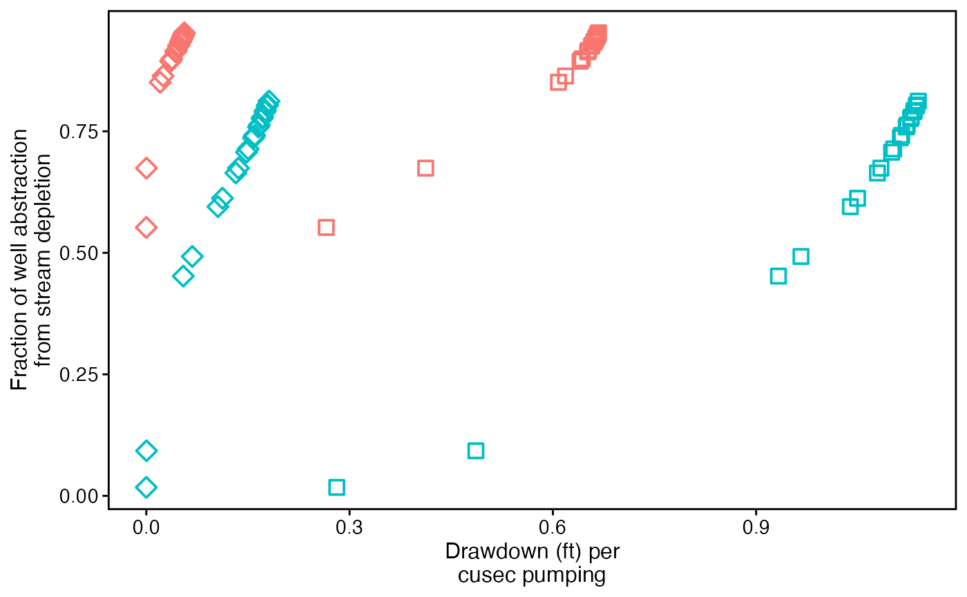
Map aquifer drawdown at four times
Now we’ll map a cross section of aquifer drawdown associated with pumping at four different values of elapsed time.
We first define a tibble with the necessary aquifer,
well, and time characteristics. These each should be units
objects. Note that some of the additional variables
(period, first_or_second) are primarily used
to create the figures.
elapsed_time_years <- c(0, 1, 4, 5)
obs_wells_distance <- c(0.1, 5)
df_prep <- tibble(t = set_units(elapsed_time_years, "year"),
             period = factor(elapsed_time_years > 1.1, levels = c(F, T), labels = c("0-1 year","4-5 years")),
             period_long = factor(elapsed_time_years %in% c(0, 5), levels = c(T, F), labels = c("0-5 years","1-4 years")),
             y = set_units(0.01, "mi"),
             well_diam = set_units(10, "ft"),
             K = K, D = D, V = V) %>%
  crossing(x1 = set_units(c(obs_wells_distance, 2), "mi")) %>%
  mutate(`Elapsed time` = factor(as.character(t), as.character(elapsed_time_years), labels = paste(elapsed_time_years, "years"))) %>%
  crossing(x2 = set_units(seq(0.02, 8, by = 0.02),"mi")) %>%
  group_by(period, x1, x2) %>%
  mutate(first_or_second = factor(row_number(), levels = c(1,2), labels = c("Initial water table", "One year later"))) %>%
  group_by(period_long, x1, x2) %>%
  mutate(zero_to_five = factor(row_number(), levels = c(1,2), labels = c("Initial water table", "Five years later"))) %>%
  group_by()
We can then get the drawdown by again calling
get_depletion_from_pumping and joining the results with the
original tibble. The pipe operator %>% and
self-referential object (.) allow us to do this in one
line.
df <- df_prep %>%
  bind_cols(as_tibble(get_depletion_from_pumping(.)))


df_ribbon <- df %>% filter(x1 == set_units(2, "mi")) %>%
  mutate(aquifer_drawdown_ratio = as.numeric(aquifer_drawdown_ratio)) %>%
  dplyr::select(period, first_or_second, t, aquifer_drawdown_ratio, x2, `Elapsed time`) %>%
  pivot_wider(id_cols = c("period", "x2"), names_from = "first_or_second", values_from = "aquifer_drawdown_ratio")

# ggplot(df) +
#   geom_line(aes(as.numeric(x2), as.numeric(aquifer_drawdown_ratio), color = `Elapsed time`)) +
#   scale_color_discrete() +
#   labs(y = "Groundwater levels (ft)", x = "Distance from river (mi)") +
#   theme_std %+replace% theme(legend.position = c(0.8, 0.3)) +
#   facet_wrap(~period, ncol = 1)
We can then plot the results.
ggplot(df_ribbon) +
  geom_ribbon(aes(as.numeric(x2), ymin = `Initial water table`, ymax = `One year later`, fill = 'Aquifer drawdown'), alpha = 0.7) +
  geom_line(data = df %>% filter(x1 == set_units(2, "mi")),
            aes(as.numeric(x2), as.numeric(aquifer_drawdown_ratio), linetype = first_or_second)) +
  scale_color_discrete() +
  scale_fill_manual("", values = "lightblue") +
  scale_linetype_manual("", values = c("dashed","solid")) +
  labs(y = "Groundwater levels (ft)", x = "Distance from river (mi)") +
  theme_diagram +
  facet_wrap(~period, ncol = 1)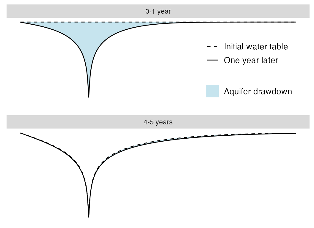
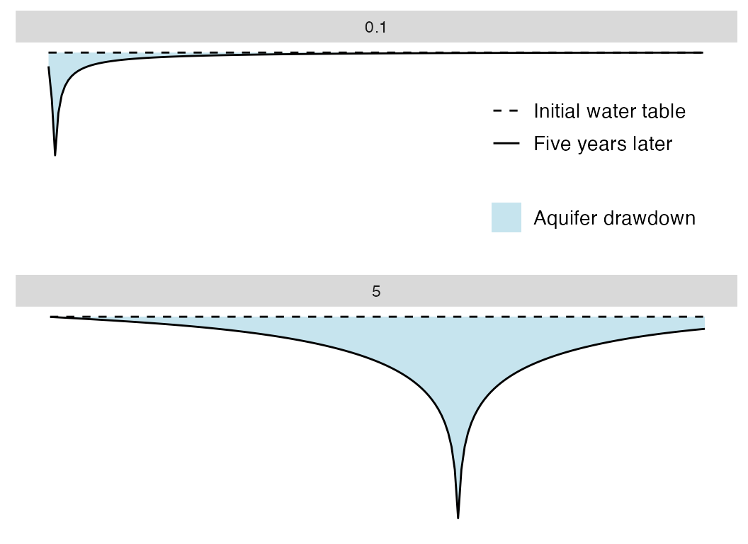
df_ribbon2 <- df %>% filter(x1 %in% set_units(obs_wells_distance, "mi"), period_long == "0-5 years") %>%
  mutate(aquifer_drawdown_ratio = as.numeric(aquifer_drawdown_ratio)) %>%
  dplyr::select(period_long, zero_to_five, t, aquifer_drawdown_ratio, x1, x2, `Elapsed time`) %>%
  pivot_wider(id_cols = c("x2","x1"), names_from = "zero_to_five", values_from = "aquifer_drawdown_ratio")
ggplot(df_ribbon2) +
  geom_ribbon(aes(as.numeric(x2), ymin = `Initial water table`, ymax = `Five years later`, fill = 'Aquifer drawdown'), alpha = 0.7) +
  geom_line(data = df %>% filter(x1 == set_units(obs_wells_distance, "mi"), period_long == "0-5 years"),
            aes(as.numeric(x2), as.numeric(aquifer_drawdown_ratio), linetype = zero_to_five)) +
  scale_color_discrete() +
  scale_fill_manual("", values = "lightblue") +
  scale_linetype_manual("", values = c("dashed","solid")) +
  labs(y = "Groundwater levels (ft)", x = "Distance from river (mi)") +
  theme_diagram +
  facet_wrap(~x1, ncol = 1)